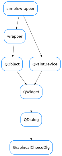
GraphicalChoiceDlg
- class GraphicalChoiceDlg(parent=None, designMode=False, choices=None, pixmaps=None, iconSize=128, defaultPixmap=None, horizontalScrollBarPolicy=0, verticalScrollBarPolicy=0)[source]
A generic dialog for choosing among a set of choices which are presented as an array of, each with a given pixmap.
The
getChoice()static method is provided for convenience so that the dialog can be invoked wit a single line:chosen,ok = GraphicalChoiceDlg.getChoice( parent, title, msg, choices, pixmaps, size, defpixmap, horizontalScrollBarPolicy, verticalScrollBarPolicy )
Import from
taurus.qt.qtgui.inputas:from taurus.qt.qtgui.input import GraphicalChoiceDlg
- static getChoice(parent=None, title='', msg='', choices=None, pixmaps=None, iconSize=128, defaultPixmap=None, horizontalScrollBarPolicy=0, verticalScrollBarPolicy=0)[source]
Static method which launches a GraphicalChoiceDlg with the given options and returns the result
- Parameters:
parent (QWidget) – The parent of the dialog (it will be centered on it)
title (str) – the text which is displayed in the title bar of the dialog
msg (str) – the text which is shown to the user in the dialog, above the choices.
choices (list<list>) – a list of lists of strings to be used as choices names. The (possibly sparse) 2D array defined by the nested lists will be used to present the choices in a grid. The choice names will be used as keys for pixmaps
pixmaps (dict<str,QPixmap>) – dictionary mapping the choices text to corresponding pixmap. If no valid pixmap is provided for a given choice, the defaultPixmap will be used
iconSize (int) – size of the icons to be displayed (128px by default)
defaultPixmap (QPixmap) – Default Pixmap to use if none passed for a given choice. No Pixmap will be used if None passed.
horizontalScrollBarPolicy (enum Qt.ScrollBarPolicy) – defines the mode of the horizontal scroll bar. The default mode is ScrollBarAsNeeded.
verticalScrollBarPolicy (enum Qt.ScrollBarPolicy) – defines the mode of the vertical scroll bar. The default mode is ScrollBarAsNeeded
- Returns:
A tuple containing choice,ok. choice is the name of the chosen option. ok is true if the user pressed OK and false if the user pressed Cancel.
- Return type:
tuple<str,bool>